import matplotlib.pyplot as plt
import pandas as pdLine
Plotting one value on a single graph
dev_x = [x for x in range(25,36,1)]
dev_y = [38496, 42000, 46752, 49320, 53200, 56000, 62316, 64928, 67317, 68748, 73752]
plt.plot(dev_x, dev_y)
plt.title("Median Salary (USD) by Age")
plt.xlabel("Age")
plt.ylabel("Median Salary (USD)")Text(0, 0.5, 'Median Salary (USD)')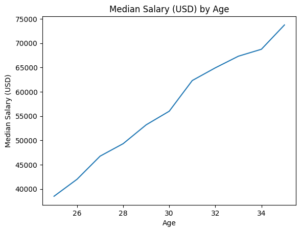
Plotting two values on a single graph
age_x = dev_x
dev_y = [38496, 42000, 46752, 49320, 53200, 56000, 62316, 64928, 67317, 68748, 73752]
pydev_y = [45372, 48476, 53850, 57287, 63016, 65998, 70003, 70000, 71496, 75370, 83640]
jsdev_y = [37810, 43515, 46823, 49293, 53437, 56373, 62375, 66674, 68745, 68746, 74583]
plt.plot(age_x, dev_y)
plt.plot(age_x, pydev_y)
plt.title("Median Salary (USD) by Age")
plt.xlabel("Ages")
plt.ylabel("Median Salary (USD)")Text(0, 0.5, 'Median Salary (USD)')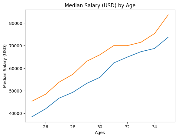
# Tip1: 플롯에 추가된 순서대로 목록을 전달하여 범례를 추가할 수 있습니다.
plt.plot(age_x, dev_y)
plt.plot(age_x, pydev_y)
plt.title("Median Salary (USD) by Age")
plt.xlabel("Ages")
plt.ylabel("Median Salary (USD)")
plt.legend(["All_Developers", "Python_Developers"])
# Tip2: plt.plot()에 레이블 매개변수 추가하기
plt.plot(age_x, dev_y, label = "All_Developers")
plt.plot(age_x, pydev_y, label = "Python_Developers")
plt.xlabel("Ages")
plt.ylabel("Median Salary (USD)")
plt.title("Median Salary (USD) by Age")
plt.legend()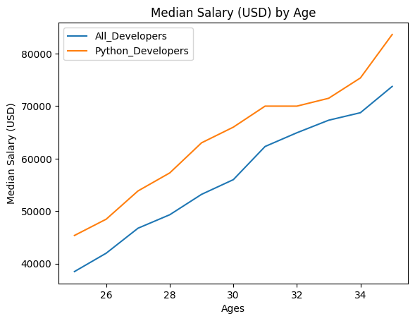
plt.plot(age_x, dev_y, "k--", label = "All_Developers")
plt.plot(age_x, pydev_y, "b-",label = "Python_Developers")
plt.title("Median Salary (USD) by Age")
plt.xlabel("Ages")
plt.ylabel("Median Salary (USD)")
plt.legend()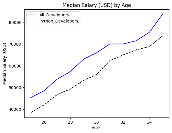
# 코드 가독성 높이기
plt.plot(age_x, dev_y, color = "k", linestyle = "--", label = "All_Developers")
plt.plot(age_x, pydev_y, color = "b", linestyle = '-', label = "Python_Developers")
plt.xlabel("Ages")
plt.ylabel("Median Salary (USD)")
plt.title("Median Salary (USD) by Age")
plt.legend()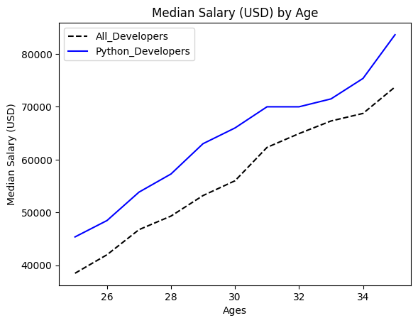
# 선에 마커 추가하기
plt.plot(age_x, dev_y, color = "k", linestyle = "--", marker = ".", label = "All_Developers")
plt.plot(age_x, pydev_y, color = "b", linestyle = '-', marker = "o",label = "Python_Developers")
plt.xlabel("Ages")
plt.ylabel("Median Salary (USD)")
plt.title("Median Salary (USD) by Age")
plt.legend()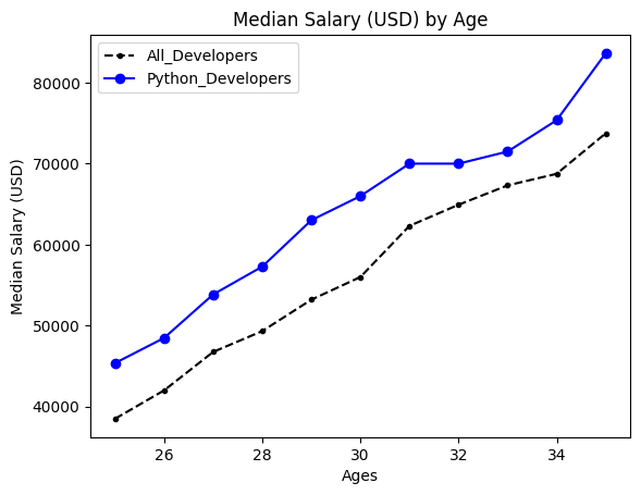
plt.plot(age_x, dev_y, color = "#444444", linestyle = "--", label = "All_Developers")
plt.plot(age_x, pydev_y, color = "#5a7d9a", linestyle = '-',label = "Python_Developers")
plt.plot(age_x, jsdev_y, color = "#adad3b", linestyle = '-',label = "Java_script_Developers")
plt.title("Median Salary (USD) by Age")
plt.xlabel("Ages")
plt.ylabel("Median Salary (USD)")
plt.legend()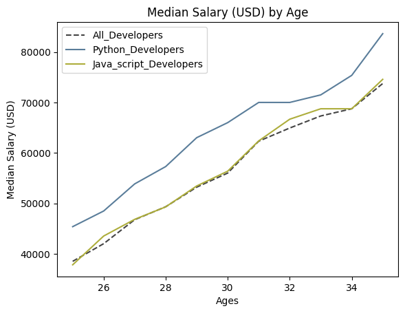
# 파이썬과 자바스크립트의 너비 변경하기
plt.plot(age_x, pydev_y, color = "#5a7d9a", linestyle = '-',linewidth = 4, label = "Python_Developers")
plt.plot(age_x, jsdev_y, color = "#adad3b", linestyle = '-',linewidth = 4, label = "Java_script_Developers")
plt.plot(age_x, dev_y, color = "#444444", linestyle = "--", label = "All_Developers")
plt.title("Median Salary (USD) by Age")
plt.xlabel("Ages")
plt.ylabel("Median Salary (USD)")
plt.legend()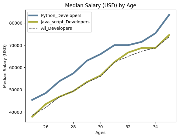
# 그래프에 패딩 추가
plt.plot(age_x, pydev_y, color = "#5a7d9a", linestyle = '-',linewidth = 4, label = "Python_Developers")
plt.plot(age_x, jsdev_y, color = "#adad3b", linestyle = '-',linewidth = 4, label = "Java_script_Developers")
plt.plot(age_x, dev_y, color = "#444444", linestyle = "--", label = "All_Developers")
plt.title("Median Salary (USD) by Age")
plt.xlabel("Ages")
plt.ylabel("Median Salary (USD)")
plt.legend()
plt.tight_layout()
# 플롯에 그리드 추가
plt.plot(age_x, pydev_y, color = "#5a7d9a", linestyle = '-',linewidth = 4, label = "Python_Developers")
plt.plot(age_x, jsdev_y, color = "#adad3b", linestyle = '-',linewidth = 4, label = "Java_script_Developers")
plt.plot(age_x, dev_y, color = "#444444", linestyle = "--", label = "All_Developers")
plt.xlabel("Ages")
plt.ylabel("Median Salary (USD)")
plt.title("Median Salary (USD) by Age")
plt.legend()
plt.tight_layout()
plt.grid(True)
Using Style!
# 사용 가능한 스타일
plt.style.available
['Solarize_Light2',
'_classic_test_patch',
'_mpl-gallery',
'_mpl-gallery-nogrid',
'bmh',
'classic',
'dark_background',
'fast',
'fivethirtyeight',
'ggplot',
'grayscale',
'seaborn-v0_8',
'seaborn-v0_8-bright',
'seaborn-v0_8-colorblind',
'seaborn-v0_8-dark',
'seaborn-v0_8-dark-palette',
'seaborn-v0_8-darkgrid',
'seaborn-v0_8-deep',
'seaborn-v0_8-muted',
'seaborn-v0_8-notebook',
'seaborn-v0_8-paper',
'seaborn-v0_8-pastel',
'seaborn-v0_8-poster',
'seaborn-v0_8-talk',
'seaborn-v0_8-ticks',
'seaborn-v0_8-white',
'seaborn-v0_8-whitegrid',
'tableau-colorblind10']# 'fivethirtyeight'
plt.style.use('fivethirtyeight')
plt.plot(age_x, pydev_y, linestyle = '-', label = "Python_Developers")
plt.plot(age_x, jsdev_y, linestyle = '-', label = "Java_script_Developers")
plt.plot(age_x, dev_y, color = "#444444", linestyle = "--", label = "All_Developers")
plt.title("Median Salary (USD) by Age")
plt.xlabel("Ages")
plt.ylabel("Median Salary (USD)")
plt.legend()
plt.tight_layout()
# 'ggplot'
plt.style.use('ggplot')
plt.plot(age_x, pydev_y, linestyle = '-', label = "Python_Developers")
plt.plot(age_x, jsdev_y, linestyle = '-', label = "Java_script_Developers")
plt.plot(age_x, dev_y, color = "#444444", linestyle = "--", label = "All_Developers")
plt.title("Median Salary (USD) by Age")
plt.xlabel("Ages")
plt.ylabel("Median Salary (USD)")
plt.legend()
plt.tight_layout()
Recap
ages_x = [18, 19, 20, 21, 22, 23, 24, 25, 26, 27, 28, 29, 30, 31, 32, 33, 34, 35,
          36, 37, 38, 39, 40, 41, 42, 43, 44, 45, 46, 47, 48, 49, 50, 51, 52, 53, 54, 55]

py_dev_y = [20046, 17100, 20000, 24744, 30500, 37732, 41247, 45372, 48876, 53850, 57287, 63016, 65998, 70003, 70000, 71496, 75370, 83640, 84666,
            84392, 78254, 85000, 87038, 91991, 100000, 94796, 97962, 93302, 99240, 102736, 112285, 100771, 104708, 108423, 101407, 112542, 122870, 120000]

js_dev_y = [16446, 16791, 18942, 21780, 25704, 29000, 34372, 37810, 43515, 46823, 49293, 53437, 56373, 62375, 66674, 68745, 68746, 74583, 79000,
            78508, 79996, 80403, 83820, 88833, 91660, 87892, 96243, 90000, 99313, 91660, 102264, 100000, 100000, 91660, 99240, 108000, 105000, 104000]

dev_y = [17784, 16500, 18012, 20628, 25206, 30252, 34368, 38496, 42000, 46752, 49320, 53200, 56000, 62316, 64928, 67317, 68748, 73752, 77232,
         78000, 78508, 79536, 82488, 88935, 90000, 90056, 95000, 90000, 91633, 91660, 98150, 98964, 100000, 98988, 100000, 108923, 105000, 103117]
plt.plot(ages_x, py_dev_y, linestyle = '-', label = "Python_Developers")
plt.plot(ages_x, js_dev_y, linestyle = '-', label = "Java_script_Developers")
plt.plot(ages_x, dev_y, color = "#444444", linestyle = "--", label = "All_Developers")
plt.xlabel("Ages")
plt.ylabel("Median Salary (USD)")
plt.title("Median Salary (USD) by Age")
plt.legend()
plt.tight_layout()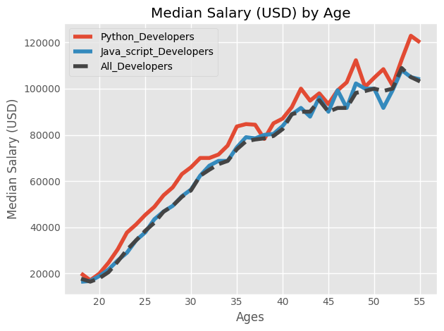
ages_x = [18, 19, 20, 21, 22, 23, 24, 25, 26, 27, 28, 29, 30, 31, 32, 33, 34, 35,
          36, 37, 38, 39, 40, 41, 42, 43, 44, 45, 46, 47, 48, 49, 50, 51, 52, 53, 54, 55]

py_dev_y = [20046, 17100, 20000, 24744, 30500, 37732, 41247, 45372, 48876, 53850, 57287, 63016, 65998, 70003, 70000, 71496, 75370, 83640, 84666,
            84392, 78254, 85000, 87038, 91991, 100000, 94796, 97962, 93302, 99240, 102736, 112285, 100771, 104708, 108423, 101407, 112542, 122870, 120000]

js_dev_y = [16446, 16791, 18942, 21780, 25704, 29000, 34372, 37810, 43515, 46823, 49293, 53437, 56373, 62375, 66674, 68745, 68746, 74583, 79000,
            78508, 79996, 80403, 83820, 88833, 91660, 87892, 96243, 90000, 99313, 91660, 102264, 100000, 100000, 91660, 99240, 108000, 105000, 104000]

dev_y = [17784, 16500, 18012, 20628, 25206, 30252, 34368, 38496, 42000, 46752, 49320, 53200, 56000, 62316, 64928, 67317, 68748, 73752, 77232,
         78000, 78508, 79536, 82488, 88935, 90000, 90056, 95000, 90000, 91633, 91660, 98150, 98964, 100000, 98988, 100000, 108923, 105000, 103117]
plt.style.use("ggplot")
plt.plot(ages_x, py_dev_y, linestyle = '-', label = "Python_Developers")
plt.plot(ages_x, js_dev_y, linestyle = '-', label = "Java_script_Developers")
plt.plot(ages_x, dev_y, color = "#444444", linestyle = "--", label = "All_Developers")
plt.xlabel("Ages")
plt.ylabel("Median Salary (USD)")
plt.title("Median Salary (USD) by Age")
plt.legend()
plt.tight_layout()
ages_x = [18, 19, 20, 21, 22, 23, 24, 25, 26, 27, 28, 29, 30, 31, 32, 33, 34, 35,
          36, 37, 38, 39, 40, 41, 42, 43, 44, 45, 46, 47, 48, 49, 50, 51, 52, 53, 54, 55]
py_dev_y = [20046, 17100, 20000, 24744, 30500, 37732, 41247, 45372, 48876, 53850, 57287, 63016, 65998, 70003, 70000, 71496, 75370, 83640, 84666,
            84392, 78254, 85000, 87038, 91991, 100000, 94796, 97962, 93302, 99240, 102736, 112285, 100771, 104708, 108423, 101407, 112542, 122870, 120000]
js_dev_y = [16446, 16791, 18942, 21780, 25704, 29000, 34372, 37810, 43515, 46823, 49293, 53437, 56373, 62375, 66674, 68745, 68746, 74583, 79000,
            78508, 79996, 80403, 83820, 88833, 91660, 87892, 96243, 90000, 99313, 91660, 102264, 100000, 100000, 91660, 99240, 108000, 105000, 104000]
dev_y = [17784, 16500, 18012, 20628, 25206, 30252, 34368, 38496, 42000, 46752, 49320, 53200, 56000, 62316, 64928, 67317, 68748, 73752, 77232,
         78000, 78508, 79536, 82488, 88935, 90000, 90056, 95000, 90000, 91633, 91660, 98150, 98964, 100000, 98988, 100000, 108923, 105000, 103117]
plt.style.use("fivethirtyeight")
plt.plot(ages_x, py_dev_y, linestyle = '-', label = "Python_Developers")
plt.plot(ages_x, js_dev_y, linestyle = '-', label = "Java_script_Developers")
plt.plot(ages_x, dev_y, color = "#444444", linestyle = "--", label = "All_Developers")
plt.title("Median Salary (USD) by Age")
plt.xlabel("Ages")
plt.ylabel("Median Salary (USD)")
plt.legend()
plt.tight_layout()
Line and Fill!
data = pd.read_csv("data/salary.csv")
data.head()| Age | All_Devs | Python | JavaScript | |
|---|---|---|---|---|
| 0 | 18 | 17784 | 20046 | 16446 |
| 1 | 19 | 16500 | 17100 | 16791 |
| 2 | 20 | 18012 | 20000 | 18942 |
| 3 | 21 | 20628 | 24744 | 21780 |
| 4 | 22 | 25206 | 30500 | 25704 |
ages = data["Age"]
dev_salaries = data["All_Devs"]
py_salaries = data["Python"]
js_salaries = data["JavaScript"]plt.style.use("ggplot")
plt.plot(ages, dev_salaries, color = "#444444", linestyle = '--', label = "All Devs")
plt.plot(ages, py_salaries, label = "Python")
plt.legend()
plt.tight_layout()
# 채우기
plt.style.use("ggplot")
plt.plot(ages, dev_salaries, color = "#444444", linestyle = '--', label = "All Devs")
plt.plot(ages, py_salaries, label = "Python")
plt.fill_between(ages, py_salaries)
plt.legend()
plt.tight_layout()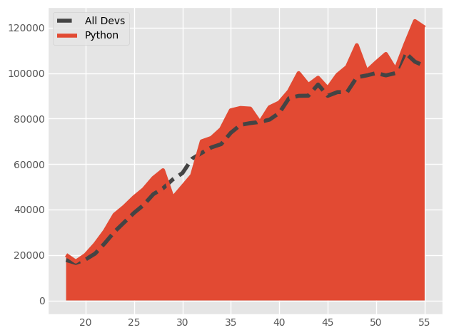
plt.style.use("ggplot")
plt.plot(ages, dev_salaries, color = "#444444", linestyle = '--', label = "All Devs")
plt.plot(ages, py_salaries, label = "Python")
plt.fill_between(ages, py_salaries, alpha = 0.5)
plt.legend()
plt.tight_layout()
overall_median = 57287
plt.style.use("ggplot")
plt.plot(ages, dev_salaries, color = "#444444", linestyle = '--', label = "All Devs")
plt.plot(ages, py_salaries, label = "Python")
plt.fill_between(ages, py_salaries, overall_median, where=(py_salaries > overall_median), interpolate = True, alpha = 0.5)
plt.legend()
plt.tight_layout()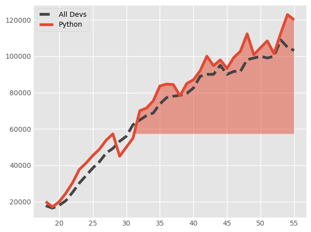
overall_median = 57287
plt.style.use("ggplot")
plt.plot(ages, dev_salaries, color = "#444444", linestyle = '--', label = "All Devs")
plt.plot(ages, py_salaries, label = "Python")
plt.fill_between(ages, py_salaries, overall_median, where=(py_salaries > overall_median), interpolate = True, alpha = 0.5)
plt.fill_between(ages, py_salaries, overall_median, where = (py_salaries < overall_median), interpolate = True, alpha = 0.25)
plt.legend()
plt.tight_layout()
# 채우기 색상 사용자 지정
plt.style.use("ggplot")
plt.plot(ages, dev_salaries, color = "#444444", linestyle = '--', label = "All Devs")
plt.plot(ages, py_salaries, label = "Python")
overall_median = 57287
plt.fill_between(ages, py_salaries, overall_median, where=(py_salaries > overall_median), interpolate = True, alpha = 0.5)
plt.fill_between(ages, py_salaries, overall_median, where=(py_salaries < overall_median), color = "green", interpolate = True, alpha = 0.25)
plt.legend()
plt.tight_layout()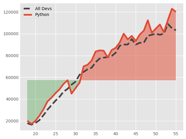
overall_median = 57287
plt.style.use("ggplot")
plt.plot(ages, dev_salaries, color = "#444444", linestyle = '--', label = "All Devs")
plt.plot(ages, py_salaries, label = "Python")
plt.fill_between(ages, py_salaries, dev_salaries, where = (py_salaries > dev_salaries), interpolate = True, alpha = 0.5)
plt.fill_between(ages, py_salaries, overall_median, where = (py_salaries < dev_salaries), color = "green", interpolate = True, alpha = 0.25)
plt.legend()
plt.tight_layout()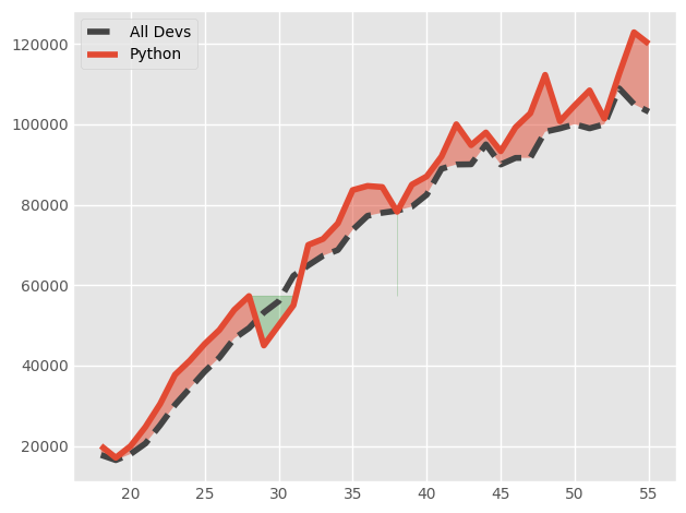
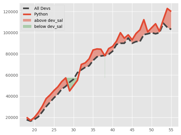
overall_median = 57287
plt.style.use("ggplot")
plt.plot(ages, dev_salaries, color = "#444444", linestyle = '--', label = "All Devs")
plt.plot(ages, py_salaries, label = "Python")
plt.fill_between(ages, py_salaries, dev_salaries, where = (py_salaries > dev_salaries), interpolate = True, alpha = 0.5, label = "above dev_sal")
plt.fill_between(ages, py_salaries, overall_median, where = (py_salaries < dev_salaries), color = "green", interpolate = True, alpha = 0.25, label = "below dev_sal")
plt.legend()
plt.tight_layout()